So last year i mentioned that I'd be explaining the process of creating a logo in this post. I wont be using just any old logo though. No sir, I'll show you how I arrived at the bennett project umbrella. I started thinking about a logo for the website as I thought it would be cool to have a branding mark of our very own. Our
, representing myself and my lovely wife. Something to throw on theoretical business cards, t-shirts, and the like. Since the bennett project
was conceived as an umbrella organization of sorts, for whatever projects me and the wife wanted to work on (and not being quite creative enough to come up with something else that worked) I settled on the obvious: an umbrella.
I guess I should mention that there was another logo. The problem was the more I saw it, the less I liked it (for this particular purpose). That is not a good thing when you intend to be branding stuff. That other logo wasn't particularly iconic. It didn't really have anything to do with the overall concept of the site. It was just fun, and looked cool. That's when I started drawing and kept going back to the umbrella
. Instead of fighting the obvious and trying to change it for the sake of being novel/cool, I embraced it and ran with it. I couldn't have just any old umbrella though. There are a lot of brands out there that use something similar already. Morton salt comes to mind (though there is a girl, in addition to the umbrella) and some insurance company. The logo had to stand out and be unique. Or as unique as I could make an umbrella without making it something else.
So one day i started doodling.
The idea here was to have an umbrella with "the bennett project" initials (tbp) in raindrops. ... Behold! The Bennett Project logo prototype: Version 1.0
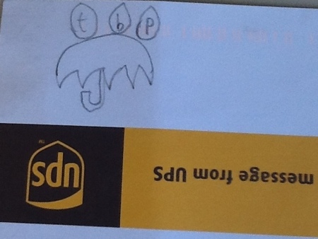
As you can see, it's quite basic but I still though it was too complex to properly convey what I was trying to get across. And yes, I suck at drawing. I also suck at handwriting. This is why we have computers. Moving on!
I had the iPad app Paper installed, so I decided to play around a bit and see what I could come up with on digital paper. As it turns out, quite a lot when you're not worried about how ridiculous or absurd looking something is. Behold the awesome, as captured by Paper.
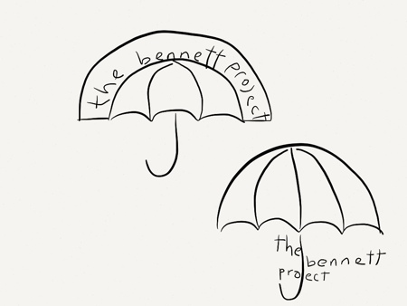
This is me trying to make the "tbp" out of umbrella's. Too cutesy.
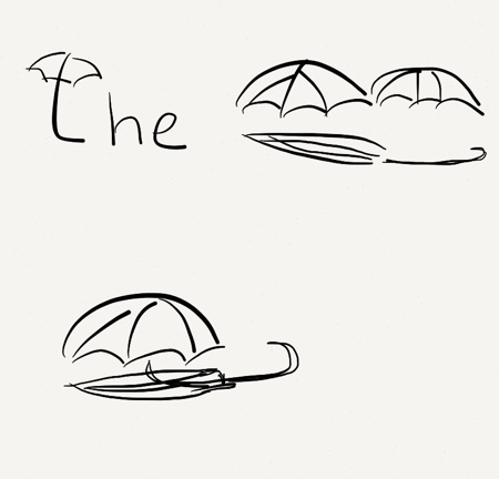
Incorporating the letters into the umbrella. The problem I had here is that the shaft of the umbrella becomes superfluous, whilst everything else had meaning. Oh, and it looks horrid.
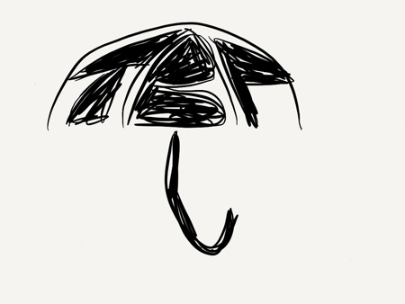
Incorporating the abbreviation into a part of the umbrella. Not bad, but the "p" messes it up for me. that hanging stem of the p dropping below the baseline was visually jarring.
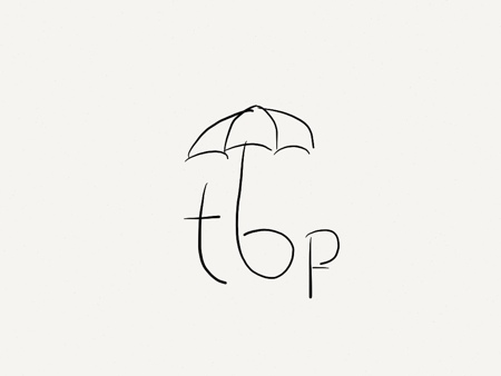
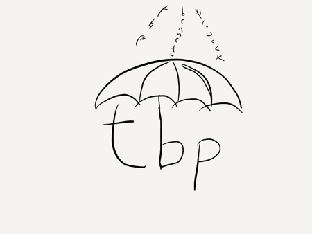
Same as before, ignoring the "p" for now, and trying to incorporate the words "the Bennett project" as sheets of rain. Verdict? Crap.
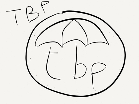
Checking out the uppercase "tbp" to see if I like the look better (and if the baseline problem can be fixed by converting to uppercase. Also throw a border around the whole thing to add some definition. The border I like. The rest ... Notsomuch!
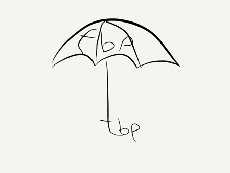
Incorporate the letters into the handle. Fail. The hanging tail of the "p" definitely kills it, but also the b. the crossed portion of the "t". This isn't a sword y'know.
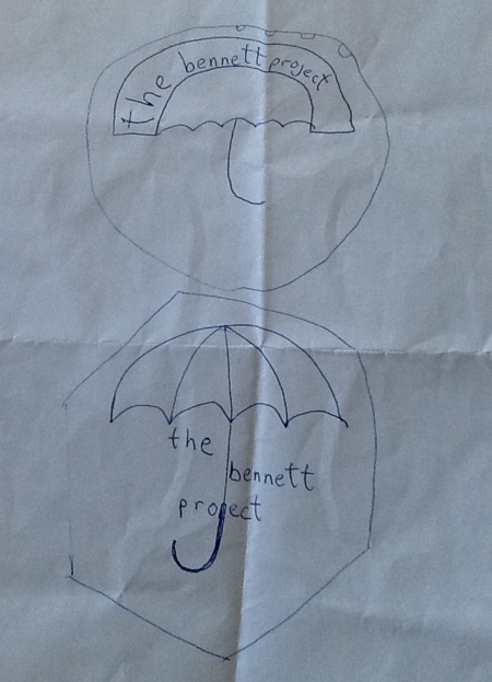
At this point it was clear that the initials just weren't working. They added too much complexity, so with my next attempt I tried to include the whole name. I left the Paper app and went to real pen and paper a bit to do some barnstorming. The first logo below looked weird, but wasn't necessarily bad. The same could be said of the second, which looked and felt much the same with a different enclosing border - hexagonal instead of circular. While i liked it, it didn't help much.
Here I have the words incorporated and have thrown some gear bits in for good measure. You know, Because it's a project; and projects are synonymous with gears. Duh!
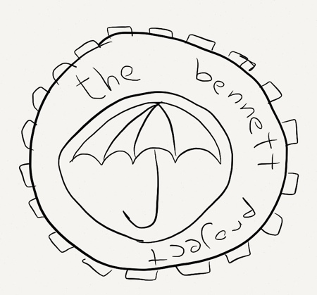
I actually liked this version quite a bit, so I stopped playing around in Paper. As you can see drawing is not my forté, and using a freeform drawing program would not have resulted in comparatively better results. This is where vector drawing programs and my "love" of math take over. After a bit of playing around in my preferred vector creation app iDraw, I had version 1.0 of the bennett project logo. Behold.
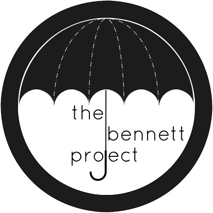
Thing is, this was meant to be a one size fits all logo. Suitable for print and the web. I think any more experienced designers in the audience are probably rolling over laughing at this point because that's something easier said than done. See, the logo at (roughly) 400x400 pixels in size, needed to be shrunk to a suitable size for : a) a webpage logo at roughly 100x100 to 150x150 px and b) a 16x16 px favicon.
Don't worry about the absolute numbers, it just means the logos had to get smaller, and still look good. The trick, is not so much the first part of that. It's the second. You see the smaller an image gets, the harder it is to read any writing. At 100x100 px we were already pushing the limits of what I saw as acceptable. At 16x16 px, or even 32x32 px, it wasn't even remotely readable. As a bonus fail, even the umbrella shape was barely distinguishable at that point.
![]()
Fortunately, I'd been around open source software long enough to learn a bit about various parts of the stack - artwork being among those parts. I knew I had to sacrifice some detail in the low end
favicon version of the logo to make the main elements identifiable. Thing is, once I did that, I came up with something that was at once (at least in my mind) more iconic, and elegant than my intentional creation. I liked it a lot more than the original logo!
![]()
So what to do? Repurpose the favicon version and make a logo out of that! And so it was that we have the current logo for thebennettproject.com

There you have it. A behind the scenes look of the (rather organic, if I can use a jargony phrase) birth of the bennett project's logo.
Have something to say/share? Fire off a tweet to @opinion8d_logic on twitter with the hash tag #creativejuices.